Looking Beneath the Surface: United States iconic landscapes
The landscape looks clear. The data says otherwise.
In this post, we’re going to borrow four iconic US landscapes to surface four questions engineers should always ask early.
What’s changing over time?
How steep is this, really?
How current (and visible) is my context?
How does water move here?
The reason why this is important is simple. In the early phase of any project, the design decisions are still reversible, and having a solid plan-B in place can save you a fortune later on.
To make this point, we’ll use some iconic locations to demonstrate why bringing the right data into your design environment early makes such a difference.
The US is a great playground for this because the data ecosystem is strong: NAIP imagery, USGS 3DEP elevation, Google Elevations, plus a growing set of premium providers. The coverage is there, so the data availability isn’t the gap. It’s when and how we use that data to influence real design decisions, before we commit to the design.
Let’s take a quick trip.
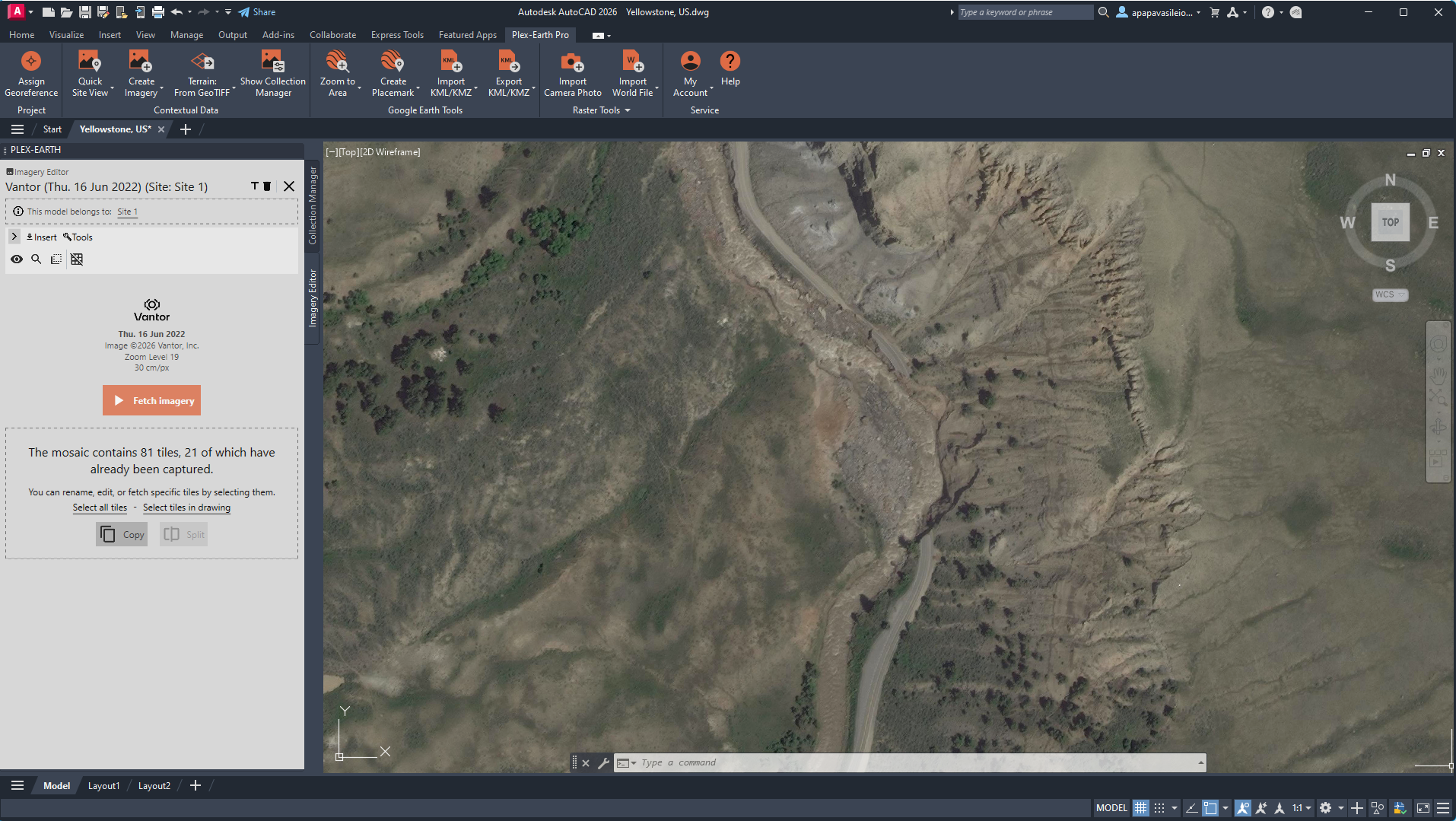
Location: Yellowstone, Wyoming, US
Provider: Vantor
Image Credit: Plex-Earth-generated imagery mosaic derived from © Vantor
Tutorial: Create Timeline: Import Historical Imagery and Monitor the Progress of a Project – Plex-Earth Support Desk
Yellowstone: What’s Changing Over Time?
For the 4 million tourists visiting Yellowstone each year, the view is mesmerising.
Steam rises from geothermal basins. Rivers braid through valleys. Forests look timeless. Solid. Ancient.
Except they’re not.
In June 2022, Yellowstone experienced one of the most significant flood events in its recorded history. Intense rainfall combined with rapid snowmelt pushed rivers like the Yellowstone and Gardner beyond their banks. Entire sections of road near the North Entrance were undermined and washed out. In some areas, the river didn’t just flood, it migrated, reclaiming parts of its historical floodplain.
Yellowstone temporarily closed. Infrastructure was rerouted. What looked permanent wasn’t.
From above, it’s a reminder: no site is static.
The engineering trap
At the concept stage, it’s easy to treat basemap imagery as fixed truth. You open it, scan it, and assume the conditions you see are stable enough to design against. But infrastructure doesn’t interact with static land. It interacts with processes. Channels migrate. Banks erode. Sediment shifts. Vegetation changes hydraulic behavior. Wildfire and flood events can reshape drainage patterns in a single season.
Let’s say we’re working on a hypothetical project in this area. Here are a few things we want to answer before locking the design:
Has the channel shifted?
Has erosion progressed toward your corridor?
Has post-event recovery altered grading or access?
Landscapes often evolve faster than design timelines. If you anchor alignment decisions to a single snapshot, you risk designing against outdated conditions and discovering it only after revisions become costly.
The data that helps
In US contexts like Yellowstone, temporal coverage is generally strong. Public imagery, such as NAIP provides a reliable baseline in many areas. However, in this specific case, NAIP did not cover the exact location we needed. For the corridor itself, there was no usable historical capture.
That’s why we turned to premium content from providers such as Airbus and Vantor (formerly Maxar), which offered multi-year, high-resolution coverage precisely over the project area.
With access to imagery from multiple acquisition dates, you can:
Compare pre- and post-event channel geometry
Identify lateral erosion and sediment bar formation
Track reconstruction activity after disturbance
Assess land cover shifts following wildfire or flood events
The insight isn’t in a single image. It’s in the comparison. When public coverage is lacking, premium historical imagery fills the gaps.
Here’s a simple workflow
Inside your CAD tool, open Plex-Earth:
Import two or more historical imagery captures from different years (Create Timeline command of Plex-Earth)
Toggle between acquisition dates to assess visible movement
Sketch preliminary alignments with awareness of migration zones
Flag historically unstable reaches before progressing the design
At this stage, you’re not running hydraulic simulations or detailed geomorphic models. You’re pressure-testing your assumptions early, before they shape fixed design decisions.
In the end, this is what you have
Instead of relying on a single snapshot, you’re designing with temporal awareness. Your corridor reflects observed movement patterns. Your feasibility study accounts for change. And your early-stage decisions are based on how the site behaves over time, not just how it looked on one day.
In our case, we monitored a road that later collapsed after the adjacent river flooded and shifted. Historical imagery have shown that the channel had been migrating toward the roadway for years. The failure wasn’t random, the movement was visible. So, we just had to identify it before, it became damage.
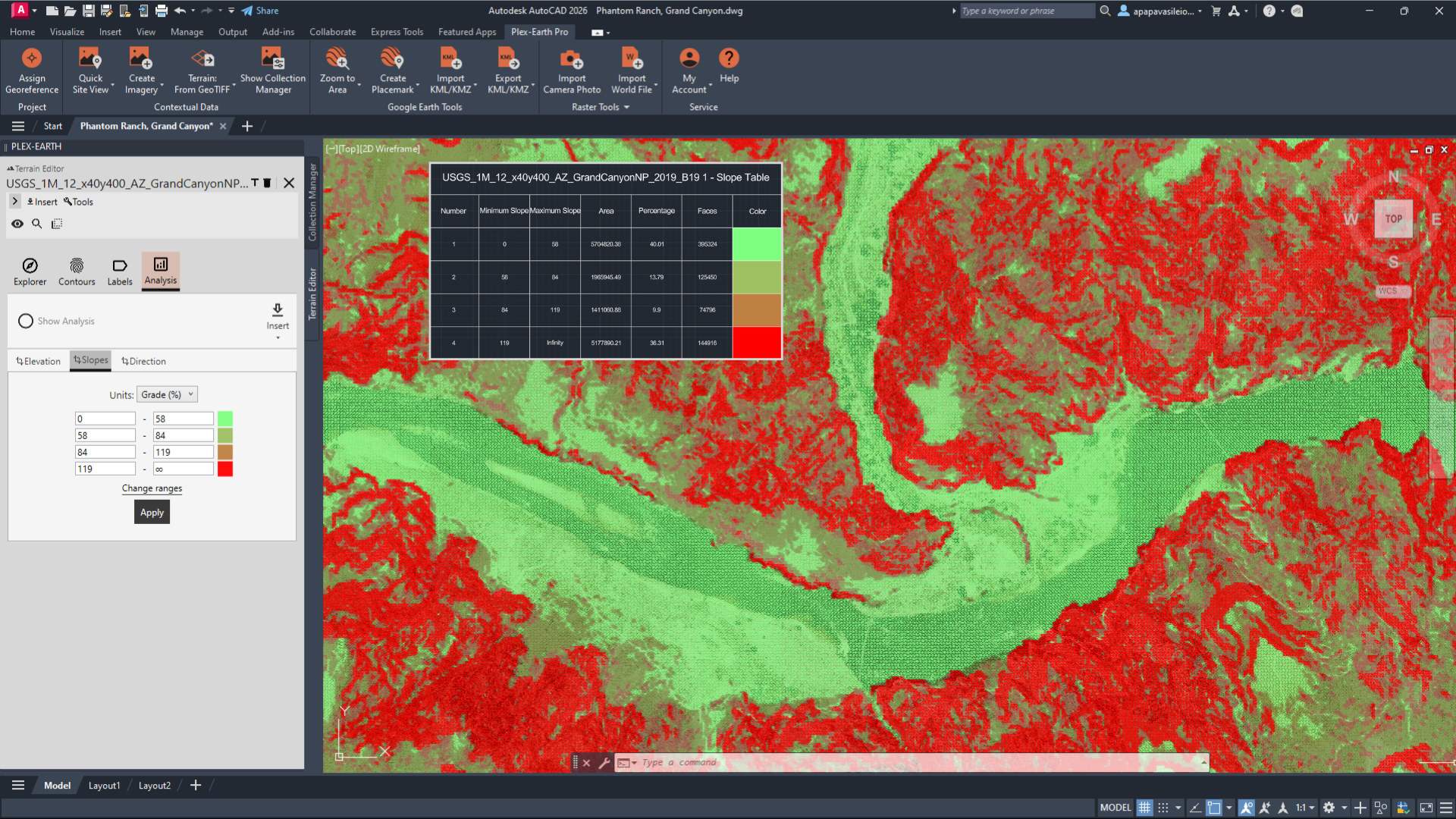
Location: Grand Canyon, Arizona, US
Provider: U.S. Geological Survey (USGS)
Image Credit: Plex-Earth-generated surface derived from © U.S. Geological Survey
Tutorial: USA: 1 meter resolution DEM - USGS – Plex-Earth Support Desk
Grand Canyon: How Steep Is This, Really?
Grand Canyon is a 277-mile-long geological marvel, filled with diverse wildlife, and for a long time, has been a magnet for hikers, rafters, and anyone looking for an adventure.
You know it’s deep. You’ve seen the photos. But nothing prepares you for the vertical drama when you’re actually there. Layers of rock plunge thousands of feet. Trails zigzag in improbable lines.
And gravity is not theoretical here.
Rockfalls are common in the canyon due to freeze–thaw cycles, natural weathering of sedimentary layers, and seasonal monsoon storms that trigger debris flows. Trails such as Bright Angel and South Kaibab are periodically closed because slope instability is a process.
Slope is not aesthetic. It is a constraint.
The engineering trap
Contours inside CAD can feel abstract to an average viewer, but for engineers, even a few lines and numbers can speak volumes about the relief, inform about ease of access for larger equipment, highlight risks to retaining structures, and signal where plan B should be in play for route planning.
In other words, the reliefs in CAD tell you everything you need to know about the site's feasibility before you even set foot in the field. And when relief is underestimated at this early stage, redesign costs follow, affecting both timelines and budgets.
The data that helps
Here, the backbone dataset is USGS 3DEP elevation data.
3DEP provides nationwide LiDAR-derived DEMs at resolutions sufficient for early terrain analysis.
With a DEM, you can:
Generate slope analysis (percent or degrees)
Extract longitudinal and cross-sectional profiles
Identify benches versus escarpments
Assess preliminary grading intensity
Imagery shows texture. Elevation reveals constructability.
Realistic 3D Slope Analysis Object
Here’s a simple workflow:
Import 3DEP DEM (Terrain from Geotiff command of Plex-Earth).
Generate contours at appropriate intervals.
Produce slope classification bands (e.g., <58%, 58–84%, 84–119%, >119%).
Extract a longitudinal profile along your proposed alignment (using Civil3D if needed).
Test minor lateral shifts to reduce grade severity.
In the end, this is what you have
Slope analysis highlights over-steepened segments, breaklines, and potential rockfall exposure zones before access routes are fixed. Grade constraints, retaining triggers, and constructability limits are identified early.
In our case, sections near Phantom Ranch and the Bright Angel Trail have been closed due to rockfall from fractured canyon walls. These are gravity-driven mass wasting processes acting on extreme slopes, not isolated incidents.
With terrain analysis at the concept stage, you identify high-risk segments before committing to alignment or access. You design to slope constraints, not around failures.
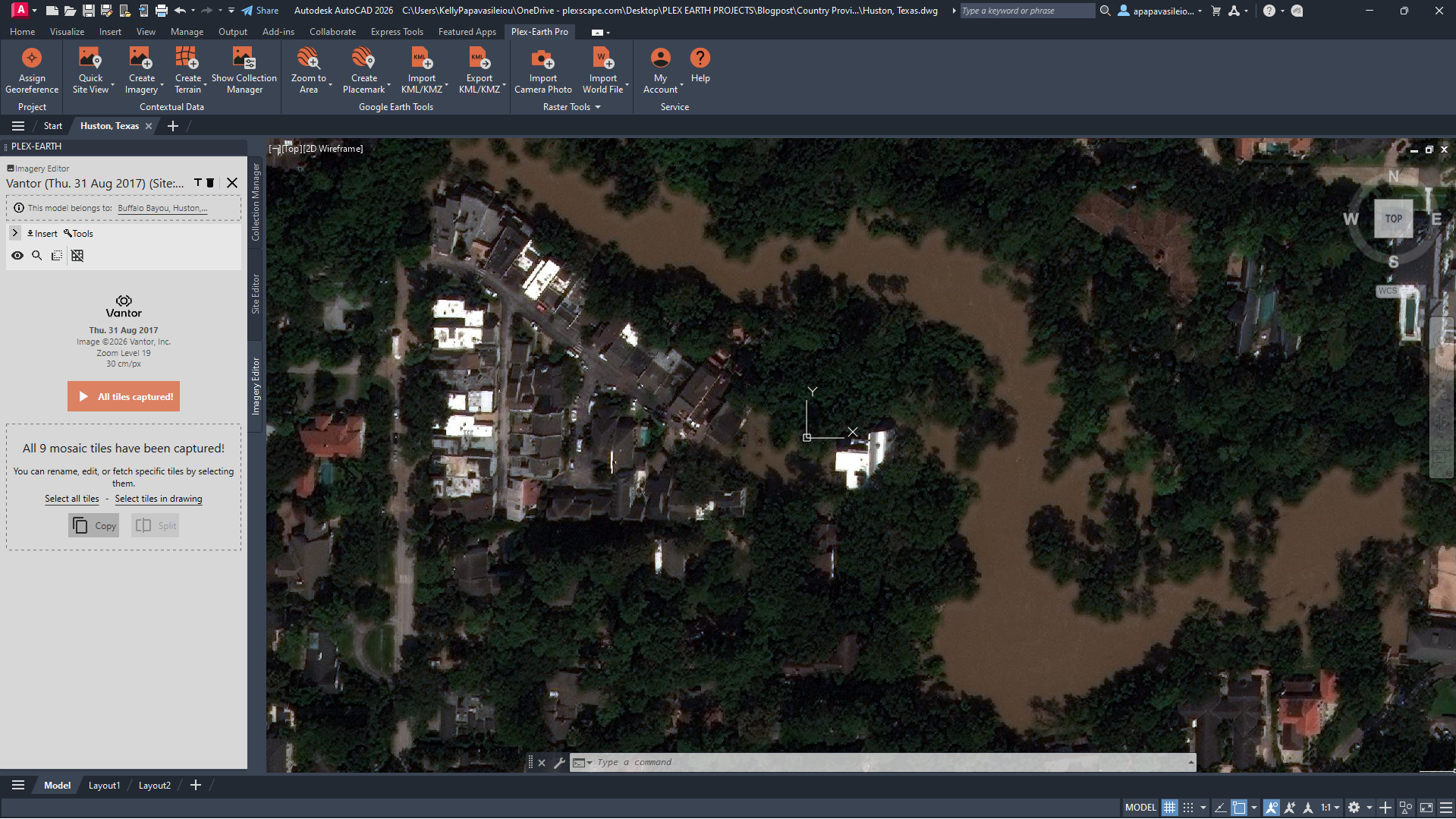
Location: Houston, Texas, US
Provider: Vantor
Image Credit: Plex-Earth-generated imagery mosaic derived from © Vantor
Tutorial: Create Timeline: Import Historical Imagery and Monitor the Progress of a Project – Plex-Earth Support Desk
Houston, Texas: How Current Is My Context?
People say that everything is bigger in Texas, and that’s certainly apparent when you drop into a dense block in Houston.
Highways. Distribution centers. Rapid infill. Subtle topography.
Houston grows fast. What was vacant two years ago may now be impervious surface. Drainage modifications appear between acquisition cycles.
In 2017, Hurricane Harvey stalled over southeast Texas and dropped more than 40–60 inches of rain in parts of the region. It became one of the wettest tropical cyclones in U.S. history. Over 100,000 homes were damaged. Major highways disappeared under water.
Houston is flat. Very flat.
Which means subtle elevation differences, sometimes less than a meter, control where water accumulates. Entire neighborhoods that didn’t perceive themselves as “flood-prone” were inundated.
The engineering trap
Urban basemaps are often treated as ground truth. You open the latest imagery, see buildings, roads, parcels, and assume the context is current enough to design against.
But cities evolve quickly.
Imagery can lag development by years. Building footprints may not reflect recent grading. Tree canopy can obscure drainage swales. Micro-relief is invisible without elevation context. In flood-sensitive, fast-growing environments, recency matters as much as resolution.
If staging areas, impervious coverage, or grading patterns have changed since the last capture, your drainage logic, access planning, and tie-ins may already be misaligned. When that mismatch surfaces during coordination or construction, revisions are rarely minor.
The data that helps
Historical high-resolution imagery from providers such as Airbus and Vantor (ex Maxar) adds both temporal depth and spatial clarity in rapidly evolving urban environments.
With premium providers, you can:
Compare development phases year-over-year
Detect grading and site preparation changes
Identify expansion of impervious surfaces
Validate updated access and staging configurations
Delineate flood-affected zones by comparing pre- and post-event captures
In our hypothetical Houston project, historical imagery allowed us to identify flood extents and clearly map the areas affected after major rainfall events. By comparing captures across years, we could see how water spread across developed parcels, which corridors were repeatedly impacted, and how surface changes influenced runoff behavior.
Paired with elevation data, imagery becomes more than visual context; it becomes evidence. Not just of what changed, but of where water actually moved. This time, we chose elevation data from Google Elevations, right inside of Plex-Earth.
Terrain helps explain why the flooding happened, not just where it appeared. In Houston’s extremely flat landscape, elevation differences of less than a meter can determine the direction water flows and where it accumulates. When you bring terrain into CAD, those subtle slopes and low points reveal the pathways that allowed floodwater to spread across the city.
Here’s a simple workflow
Inside CAD, the process remains lightweight:
Import the most recent premium Imagery Timeline (Import Timeline command of Plex-Earth)
Overlay prior-year imagery for direct comparison
Identify grading, construction, or land cover changes
Overlay elevation data to reveal subtle depressions and flow corridors (Import Terrain command of Plex-Earth)
You’re not performing a full hydrologic study. You’re verifying that your design reflects current ground reality.
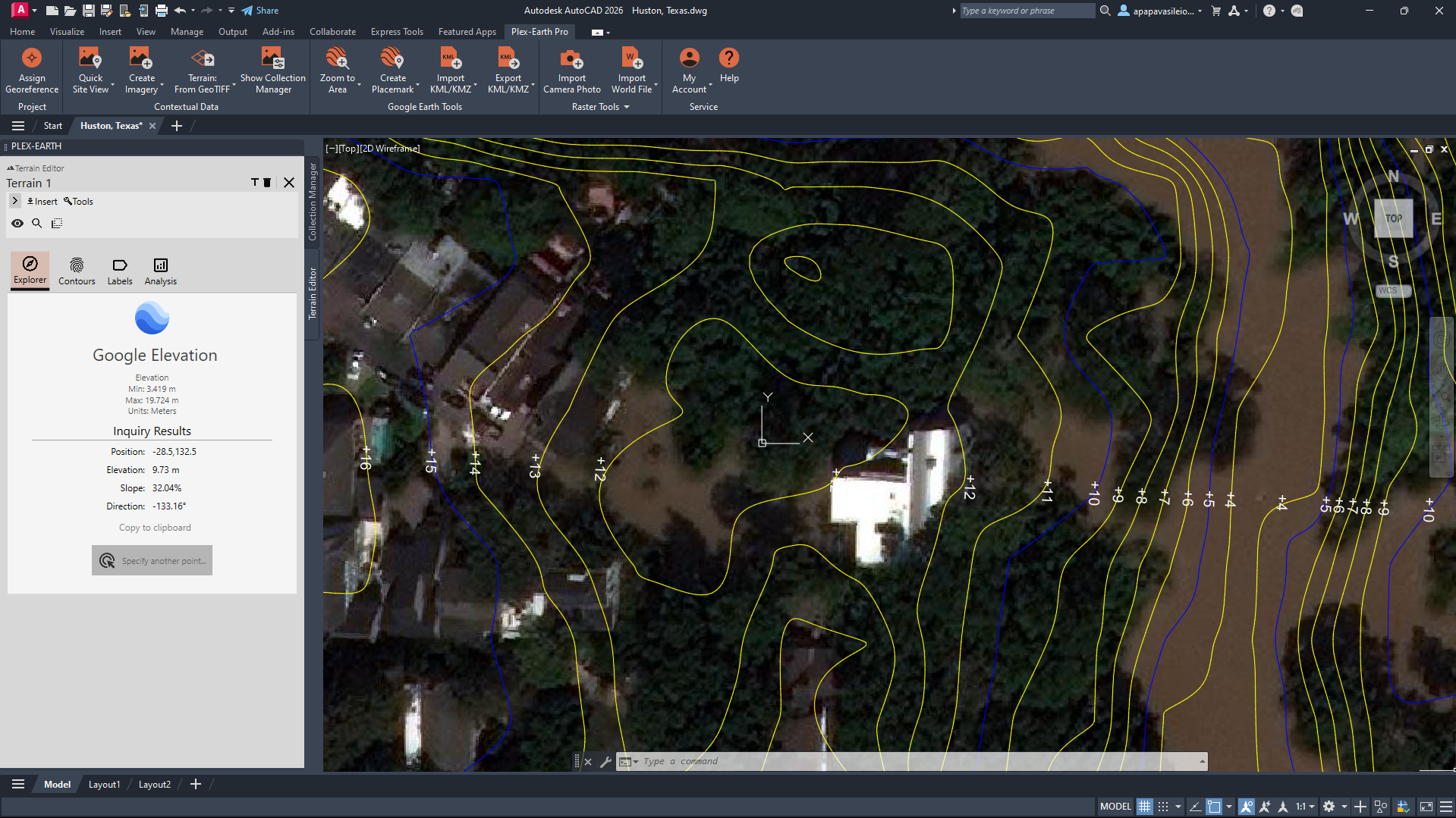
Location: Houston, Texas, US
Provider: Vantor & Google Elevations
Image Credit: Plex-Earth-generated imagery mosaic derived from © Vantor & Plex-Earth-generated terrain contours derived from © Google Elevations
Tutorial: Create Terrain: Import Elevation Data in AutoCAD/Civil 3D – Plex-Earth Support Desk
In the end, this is what you have
If you used historical imagery to identify flood-affected areas, then the value isn’t just “designing against present conditions.” It’s understanding how the site behaves over time, especially under stress.
-Flood extents are mapped, not assumed.
-Repeatedly affected parcels are identified early.
-Drainage decisions reflect observed behavior, not theoretical flow paths.
This is where real context becomes verified input, not a hidden liability.
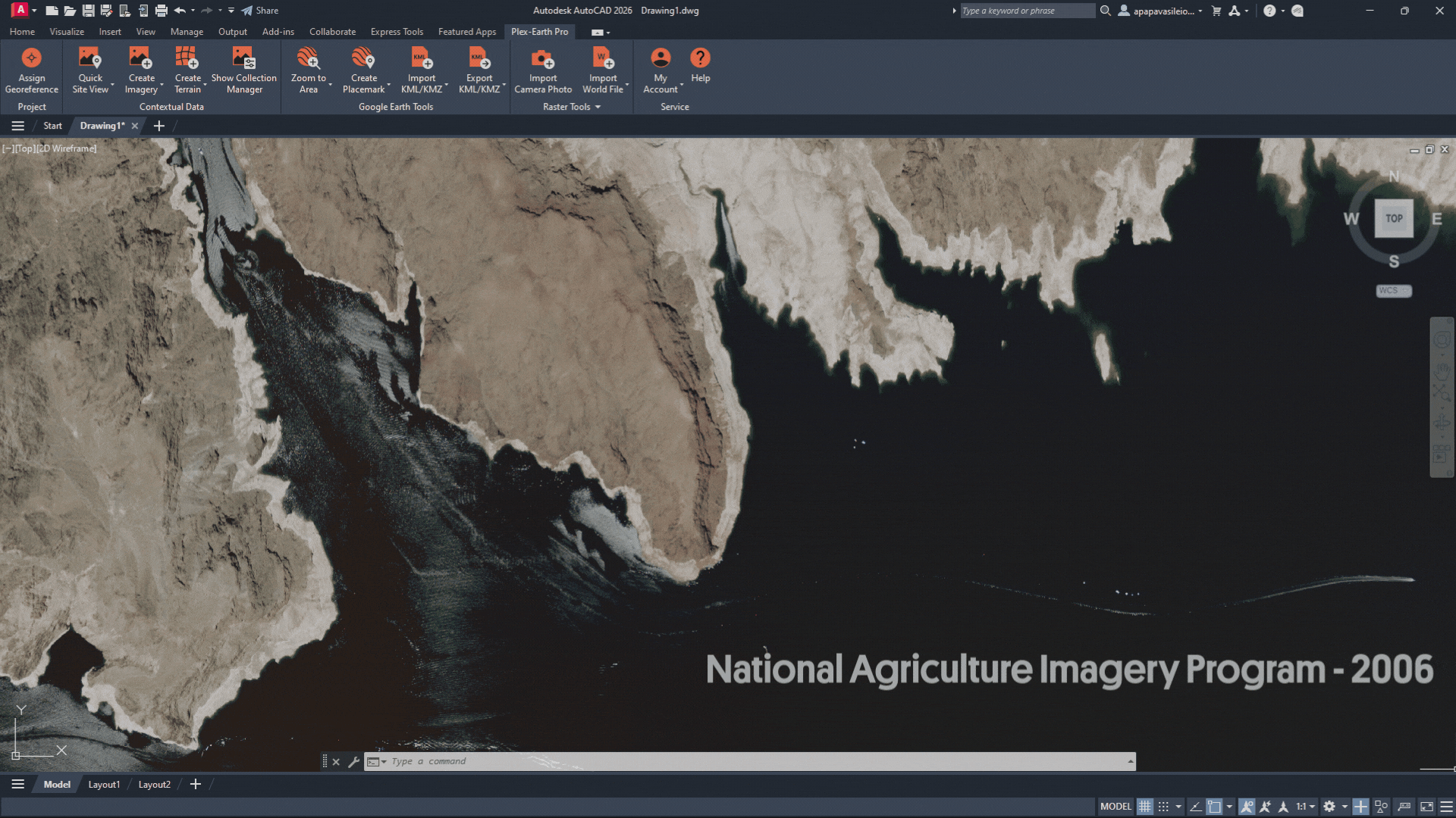
Location: Lake Mead, Nevada, US
Provider: National Agriculture Imagery Program (NAIP)
Image Credit: Plex-Earth-generated imagery raster derived from © National Agriculture Imagery Program (NAIP)
Tutorial: Import or Export Raster Image with World File – Plex-Earth Support Desk
Lake Mead: How Does Water Move Here?
Lake Mead is located just 45 minutes from the Las Vegas Strip, and the contrast between the buzzing, lit-up streets and the calm waters couldn’t be any stronger.
And you don’t have to be an engineer to notice… there’s something a bit off here.
White “bathtub rings” mark where the water used to be. Marinas sit far from their original shorelines. Water intake installations that once operated comfortably near the surface now stretch toward lower elevations.
Since 2000, Lake Mead’s water level has dropped more than 150 feet due to prolonged drought and sustained water demand. NASA’s Earth Observatory has documented the decline repeatedly. The visual evidence is stark.
Water systems are dynamic. Lakes shrink. Rivers swell. Floodplains expand and contract.
And yet, in design, we often treat water as a line on a map.
The engineering trap
Water-adjacent design often assumes stability.
But reservoirs are operational systems layered on environmental stress. At Lake Mead, water levels have dropped dramatically over the past decades due to prolonged drought, reduced Colorado River inflows, and sustained demand. Shorelines have retreated hundreds of meters in some areas. Previously submerged terrain is now exposed.
Water is not static, and neither is the edge you’re designing against.
If you anchor grading, access, or infrastructure placement to a single pool elevation, you risk misjudging setbacks, slope exposure, and future usability.
The data that helps
For Lake Mead, multi-year NAIP imagery provides consistent, high-resolution time-series coverage across years.
By comparing historical NAIP captures, you can:
Visualize long-term shoreline retreat
Identify newly exposed sediment plains
Map variability in water extent across years
Correlate visible retreat with elevation bands
Public datasets are often sufficient, when used comparatively rather than as a single snapshot.
Here’s a simple workflow
Inside CAD, the process remains straightforward:
Import NAIP imagery from multiple acquisition years (Import World File command of Plex-Earth)
Delineate historical shoreline positions
Overlay shoreline extents against terrain data (Optional)
Identify elevation bands corresponding to different pool levels (Optional)
In the end, this is what you have
Instead of designing against a single recorded shoreline, you design with an understanding of historical variability. Setbacks are defined based on observed water level fluctuations rather than one pool elevation.
Newly exposed slopes are assessed for stability, access, and erosion potential. Grading and infrastructure placement account for long-term decline trends and the range of documented water extents. The design reflects measured change over time, reducing the risk of anchoring decisions to a temporary condition.
The Bigger Pattern
To sum up:
Yellowstone: premium historical imagery (Airbus + Vantor) for temporal geomorphic change.
Grand Canyon: USGS 3DEP for slope and relief validation.
Houston: premium multi-temporal imagery (Airbus + Vantor) for recency and surface change.
Lake Mead: NAIP time-series imagery for hydrologic variability.
Four landscapes. Four repeatable checks:
Temporal change analysis
Slope validation
Recency verification
Hydrologic screening
The US data ecosystem already supports these evaluations.
The issue isn’t availability. It’s timing.
Too often, high-quality imagery and elevation enter the workflow after geometry feels fixed, after assumptions harden, after early reviews.
At that point, better data feels disruptive. Introduced at concept stage, it becomes preventative.
Try the Four-Check Workflow on Your Next U.S. Site
Bring historical imagery and elevation directly into your design environment and test the four-check method on your own project:
Compare imagery vintages.
Validate slope using 3DEP terrain.
Confirm recency in fast-growing urban areas.
Screen water-adjacent alignments against topography.
Start a free trial of Plex-Earth and explore how Airbus, Vantor, NAIP, USGS 3DEP & Google Elevation datasets integrate directly into your CAD workflow.
Do you have a US data provider you’d like to connect to your CAD workflow?
A link to the provider
The format available (GeoTIFF, WMS, DEM, etc.)
The type of project you’re working on
Your site could be the next story we explore.